Joe 90: Top Secret (1969)
 |
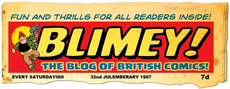
| Cover by Frank Bellamy. |
I had this comic as a child but sold them long ago. However I recently purchased several issues in excellent condition at fairly reasonable prices so it's time to give the publication some long-overdue coverage starting with the earliest issues.
There's always been some disagreement about the actual title of the comic. Since childhood, some of us have always thought it was called Joe 90: Top Secret due to the ever-present 'stamp' on the logo. However, in the actual comics, letters pages, etc it's only referred to as Joe 90. To add to the confusion, the one annual that the comic spawned was definitely advertised as Joe 90/Top Secret Annual but that may be because the ad was produced by a different department. However I still prefer the longer title and to my mind it'll always be Joe 90: Top Secret but for the sake of brevity I'll just refer to it as Joe 90 for the rest of this post.
Published by City Magazines in co-operation with Century 21 it was launched on 15th January 1969. Joe 90 was a companion paper to TV21 and followed the same format of having 20 tabloid sized pages, printed in high quality photogravure. Six pages were in full colour. The cover design of the early issues was quite distinctive, leading with a documentary style opening to the Joe 90 comic strip over the page.
It has to be said that unfortunately Joe 90 was one of the weakest strips in his own comic. I suspect the editors knew this too, which may be why the comic's full colour pages were devoted to two strong and dynamic supporting strips based on American TV shows. Before we get to those though, here's a quick look at an originated strip in the comic, Ninepence + Tenpence = Sport. Perhaps someone felt Joe 90 needed a traditional sports story, and created this serial of two Inuit boys with a talent for football. Drawn by Alfredo Marculeta, who had also been the artist of Rubberman in Smash!
The free gift in Joe 90 No.1 was a cardboard model of the 'Jet-Air Car' from the series. Nowhere near as slick as the excellent Dinky toy but it was an amusing novelty with its matchstick and rubber band 'engine'. My gift is long gone but here's the page showing the instructions for it...
Proudly running across the centrespread of every issue was a strip version of Star Trek, excellently illustrated by Harry Lindfield. The one big drawback was... the TV series wouldn't premiere on British television for several more months (July 1969), even though it had been on American TV since 1966. Yes, for us as kids back then the weekly comic strip was our first knowledge of Mr.Spock, the USS Enterprise and Captain Kurt...
Wait. Did I say Captain Kurt? Yep, that's what he was called in the first two episodes of the comic strip! Presumably someone in editorial mis-heard the name. No videos or DVDs for reference in those days of course.
Things got even stranger in Joe 90 No.2, where the script called for Harry Lindfield to draw a scene showing the Enterprise landing on a planet! Lindfield chose to have the starship hover just above the ground rather than add wheels to it.
Joe 90 seemed to be aiming to be more of a traditional tv comic than the shared-universe theme in TV21. Living up to the 'Top Secret' aspect was The Champions, based on the British secret agent TV series. Art by Jon Davis.
The other strip that was awarded the full colour treatment was Land of the Giants, based on the popular Irwin Allen show. Great artwork by Gerry Haylock. The first three issues adapted the first episode. Considering how accurate it was I'm sure Gerry Haylock must have had access to numerous photographic stills from the episode. Here's the full adaptation from issues 1 to 3 of Joe 90...
Towards the end of Joe 90's short run of just 34 issues it became obvious that the title character wasn't the selling point, so Land of the Giants and Star Trek took turns to appear on the covers. In September 1969 Joe 90 merged into TV21 and restarted as TV 21 and Joe 90 with a new No.1 (although the merged comic was more like Joe 90 than its parent title).
I'll take another look at some issues of Joe 90 soon, with a focus on the Joe 90 strip itself. In the meantime, here are the covers to issues 2 and 3. Click on them to see them full size...


15 comments:
Great review Lew. I always thought it strange in TV21 that Fennell used Bellamy for covers (in TV21's case, Captain Scarlet) and here it's weird in my opinion as he has had to use the available space and to be honest it's not that exciting, is it? And the lead character and that fantastic gizmo BIGRAT doesn't even appear! And then he wasn't used again! Strange IMHO!
Yes, the early Joe 90 covers were a bit dull in a way. Joe himself never appeared in the illustrations, except in a photo insert, and the focus was on the vehicles etc. Yet even the distinctive flying car was never shown on the cover (except for the free gift illo on No.1). Very odd. I'm even wondering if those cover illustrations were intended for something else, then had a story written around them later?
I think the later covers are far better, with exciting scenes from Land of the Giants and Star Trek. I've been informed that City expected Star Trek to be on TV by the time they launched Joe 90 comic but of course it wasn't, so there was probably a feeling of despondency about the comic from the outset.
Yes, Lew - good point. Alan Davis has a photo of a cover by Bellamy for Joe 90 #8 and the story DID appear but not his drawing! (http://www.alandavis-comicart.com/images/Joe_90.jpg)
I totally agree re the Haylock covers of Land of the Giants.
This gets even more intriguing! Thanks for the link to that art, Norman. Nice Bellamy art but strangely the characters all have their faces turned away or hidden, which occurred a lot in those early issues. What the heck was going on with editorial decisions there I wonder? They used a photo cover in the end for that issue.
Thanks Lew. I remember getting these issues but have no recollection of Ninepence and Tuppence. Another pesky football intrusion. I guess any black and white strips like Joe and The Champions would suffer in comparison with the double whammy of Haylock and Lindfield. The spacesuit in Trek looks like it was inspired by 2001. Wasn't there a campaign to get the UK Trek comics reprinted? I'd buy any collections by these two artists - Dr Who,Trek,
Giants, Persuaders - bring 'em on.
There was talk of a collection but it'd be so expensive to reprint all those full colour strips and deal with Paramount I guess. Or whoever owns the rights now. It's a shame because it had some top artists on it, even though the scripts were usually standard fare.
Great post, Lew. Look forward to more Joe 90's, being as how I skipped them at the time. I think the Gerry Haylock art is stunning. I gather he used a lot of photos for his Doctor Who strips as well. But, what the heck? - It gave good results!
Absolutely. Every artist uses photo reference at some point, especially in strips based on TV shows. The trick is not to make the strips look posed and static, and Gerry Haylock managed it superbly.
interesting ^_^
though the Original enterprise COULD land, but only the saucer part. Saucer separation was only stated in show twice (the first being 'The Apple' I believe) and they didn't have the budget for it. But the landing gear was design and visible as marks on the underside. One major Plot point Gene Roddenberry wanted in the third film was the old separated saucer section to reunion with a new engine section as a bit of symbolism but .. things happened so the whole ship got destoried instead. however.. that 'pod' from the phrase banks is a bit iffy.. and the scale I WAY out ^_^..
I thought the idea of the underside markings housing the landing gear was only fan speculation? It wasn't stated in the show that the Enterprise could land was it?
debatable. To quote the guy who redesigned the model of the original enterprise for the first film (Richard Taylor):
"Popular opinion indicated that [on the original ship] the two triangular points on the underside of the saucer were actually two landing legs, and the third one would be a telescoping leg in the doral-support cavity, so the saucer would have tricycle landing gear for a planet landing. For The Motion Picture's Enterprise, I designed four landing pads on the underside of the saucer."
The Refit was clearly able to land, and the original could separate.. one writers guide for the original show does say it doesn't land, but people debate if Matt Jefferies (the original model builder) put them there as Landing gear (since, like said, the saucer was made to move apart from the main body for short trips and when needed)..
So it's a bit of a huge debate on the subject ^_^ some official guides say yes, some say no.
It sounds like he was just saying that's what people's opinion was of the 1960s Enterprise, not how it was actually intended to be. Then he decided years later to go along with that opinion and put landing pads on the movie version he designed.
very possible, but like I said, official sources are all over the place and it seams by 2003, then Matt Jefferies died, people hadn't gotten a final answer from him. either way, it at least can't have the engine section land. ^_^
Someone just mentioned on TV Forum that Joe 90 didn't air on Yorkshire Television until 1982. So that won't have helped the comic sell in that part of the country.
http://tvforum.uk/forums/post982875#post-982875
As late as that? Wow. I'm glad I lived in the ATV region where we saw all the Anderson shows.
Post a Comment